Recruitment Analytics: Why the Dashboard Is Never the Problem
What recruitment analytics is, why recruiting data breaks before it reaches a dashboard, and what recruitment analytics software actually does.
Get the top-of-funnel data your ATS never sees - search, contact, outreach and replies in one place.
Almost every recruitment analytics project starts by choosing a dashboard and ends by quietly not being looked at. The reason is nearly always upstream: the numbers going in were defined loosely, entered late, and never segmented, so the chart is an honest picture of unreliable data. Analytics is a data-discipline problem wearing a reporting costume.
What recruitment analytics actually is
Recruitment analytics is the practice of reading recruiting data in comparison. Over time, and split by source, by recruiter, by role type, by client.
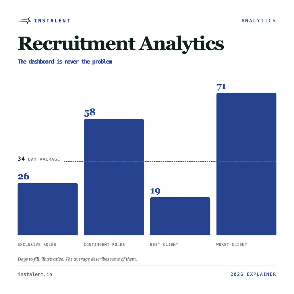
The distinction that matters is against reporting. Reporting is descriptive: forty-one placements last quarter, an average time to fill of thirty-four days. Analytics is the comparison that changes a decision: twenty-six days on exclusive roles and fifty-eight on contingent ones, which is an argument about which roles to accept rather than a fact about last quarter.
A useful test, and it is stricter than it sounds. If nobody would do anything differently depending on the answer, you are reporting. Most recruiting dashboards fail it on every tile.
The data breaks before it reaches the dashboard
This is the part the software category does not talk about, because no tool can sell you a fix for it.
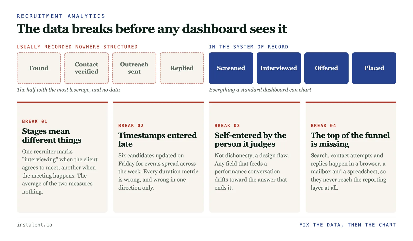
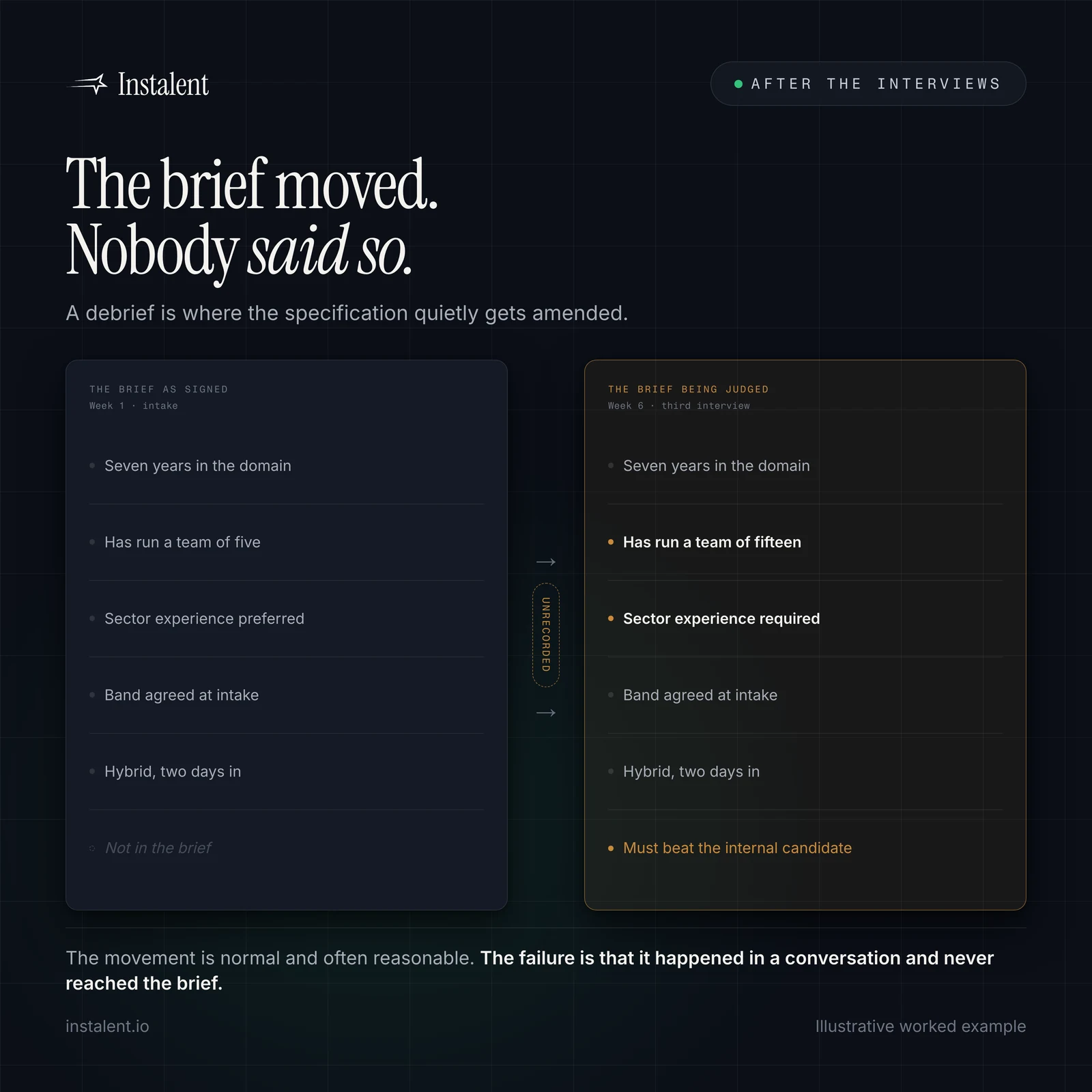
Stages are not defined identically across the desk. One recruiter marks "interviewing" when the client agrees to meet someone; another when the meeting happens. The average of those two is not a measurement of anything.
Timestamps are entered retrospectively. Someone updates six candidates on Friday afternoon for events spread across the week. Every duration metric you build on those records is wrong by up to five days, and wrong in one direction only.
The person entering the data is the person it will be used to judge. That is not a claim about dishonesty. It is a design flaw: any field that feeds a performance conversation will drift toward the answer that ends the conversation.
The system only sees candidates from the moment they became applicants. Sourcing, contact attempts, first-touch outreach and replies routinely happen in a browser, a mailbox and a spreadsheet. So the earliest part of the funnel, which is the part with the most leverage, is the part your dashboard has no data about at all.
A clean-looking dashboard is not evidence of clean data
Charts render whatever they are given. A dashboard built on retrospective timestamps and inconsistent stage definitions looks exactly as authoritative as one built on good data - which is precisely why teams trust it and act on it. Before adding a tile, pick one metric and hand-check ten records against reality. Most teams find at least three that do not match, and that finding is worth more than the rest of the project.
The benchmark trap
The instinct once you have a number is to compare it to an industry figure. That comparison is usually meaningless, and here is a concrete demonstration rather than an assertion.
SHRM's recruiting benchmarking research - drawn from over 4,600 organizations - reports a median time to fill of 39 calendar days for nonexecutive roles. It is a real figure from a real sample, and it is the one most people reach for.
Now try to use it. Time to fill can be measured from requisition approval, from the day the role was signed off internally, from the first candidate contacted, or from the day the client called. Those spans can differ by weeks on the same hire. SHRM's benchmarking page publishes the number without stating on that page which span it used, so unless you go to the full report and match its definition exactly, "we are at 47 versus an industry 39" is a comparison between two different measurements that happen to share a name.
The rule this produces is simple. Benchmark against your own past self. Your definition is at least consistent with itself, which is more than you can say for any external comparison you have not verified line by line. Use industry figures for direction, never for scoring.
One number, four cuts
The single most valuable habit in recruitment analytics is refusing to look at an unsegmented number. Four cuts do most of the work:
- By role type. Exclusive or engaged versus one of several agencies. Most desks have never split this, and the gap usually ends the argument about which business to accept.
- By client or hiring manager. Time to fill is partly a measurement of how fast the other side moves. Splitting by account turns a recruiting metric into a commercial one.
- By source. Referral, mapped market, inbound, cold search. This is what tells you where to spend next quarter.
- By recruiter, carefully. Useful for finding a process that works and copying it. Corrosive the moment it becomes a scoreboard, because the data is self-entered.
The formulas behind the metrics themselves - time to fill versus time to hire, quality of hire, cost per hire, funnel pass-through - are a separate subject, covered in recruiting metrics and what each one hides. This post is about what to do with them once you can calculate them.
What a first dashboard should show
Most recruiting dashboard examples you will find online are screenshots of twenty tiles, which is a picture of a tool rather than a working instrument. Five to eight numbers. Each one with a segmentation and a trend, or it does not earn its tile.
- Time to fill, split by role type
- Funnel pass-through by stage, so you can see the earliest weak rate rather than the worst one
- Fill rate, split by exclusive versus contingent
- Source of hire, in whatever categories you actually work
- Offer acceptance rate, read next to the volume it came from
- Placements from people you already knew versus from cold search, which is the number that tells you whether your database is an asset or an archive
Two of those are engagement rather than throughput. Whether people are responding at all is its own measurement problem, and activity counts do not capture it - candidate engagement covers the four numbers that do.
Recruitment analytics software, honestly
The category is three different things sold under one name.
Reporting modules inside an applicant tracking system. Nearest to the data, weakest at comparison, and blind to everything that happened before someone became an applicant. Fine as a starting point.
Business-intelligence tools pointed at your recruiting database. Genuinely powerful and genuinely a project. Worth it above a certain size, and a way to spend two quarters visualising bad data below it.
Point tools that measure one slice. Sourcing analytics, interview scheduling analytics, assessment analytics. Useful, narrow, and another place for a definition to diverge from the one in your ATS.
None of the three fixes inconsistent stage definitions or late timestamps. Buy in that order only after you have hand-checked ten records, because the tool inherits whatever discipline you already had.
Start smaller than the software wants you to
You can do the first useful pass this week, in a spreadsheet.
- Pick one metric that would change a decision. Usually fill rate by role type, or time to fill by client.
- Write down its definition in one sentence and get the desk to agree to it. This is the whole project, and it is the step that gets skipped.
- Pull the last twenty closed roles by hand. Twenty is enough to see a shape and small enough that you will actually finish.
- Split it one way. Just one.
- Decide something. If the split does not change a decision, pick a different metric rather than a better chart.
Do that four times and you have a dashboard worth building, plus definitions the dashboard can be built on.
Where the missing data usually is
The gap in most recruiting dashboards is not the reporting layer. It is that the top of the funnel was never recorded anywhere structured: who was found, whether a contact detail was verified or guessed, what was sent, on which channel, and whether anyone replied.
Instalent is not an analytics product and it is not trying to be one - the same position we take on CRMs and applicant tracking systems. What it does is generate that top-of-funnel record as a by-product of doing the work: search across sources, verified contact details with the verification recorded, multichannel outreach, and every reply landing in one shared inbox rather than in an individual's mailbox. That data syncs to RecruiterFlow, Greenhouse, Lever or TeamTailor, where your reporting already lives.
Want the half of the funnel your dashboard cannot see? Get started and run one real role end to end.
Related reading: recruiting metrics: the formulas is the arithmetic layer beneath this one, recruitment agency growth strategy for 2026 is the strategy layer above it, and talent mapping is how the "people you already knew" number gets bigger.
Sources
- SHRM - Recruiting Benchmarking research - data from over 4,600 organizations; median time to fill of 39 calendar days for nonexecutive positions
Find better candidates, faster
Source, verify and reach candidates on one engine. Get 25% off your first month.
Keep reading